so much depends
upon
a solitary entry
door
glazed with coral
paint
beside the tangy
porch.*
It turns out, that photographing the front door is going to be next to impossible with the screen door still in place. As doors often make it onto the “to do” list around these parts, but seldom make it off that list, it could take awhile to actually see the front entry door due to the screen. Unfortunately, it’s not a simple as taking the screen off (despite the spate of dreams I’ve had to the contrary!) as the former owner was, uh, creative in his approach to installation. Like so much in our home, the screen door makes me a little nutty just looking at it. Because, I know what that man did to put it in, and it isn’t pretty. Taking it out will do serious damage to the house and will require restoration work on our part. No easy fix.
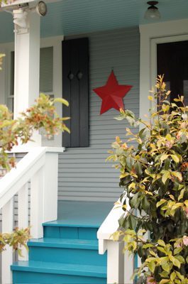
So, in the mean time, what to do about my tangy porch? IZ has decided he likes the color. I’m not enchanted, because as one of the comments suggested, the color is too warm for these cools and neutrals in play on the house. However, we’re not going to repaint it just yet. The steps are already beginning to flake (welcome to the rain storm yesterday!) and it seems to me that this porch painting business is going to be an annual event. That leaves me a year to find the color I was shooting for and clearly missed. Who doesn’t need a quest of some kind?
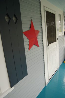
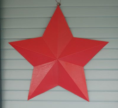
But, waiting a year to paint the porch and waiting who knows how long to remove the screen equals a lot of waiting! That will never do! Instead, I’ve painted our big star the color of the entry door. The Coral Star is loquacious; she and the Porch door have hit it off splendidly and are chatting like old friends. Their chatter will have to suffice for now.
As quickly as it began it is over. We are painted, at least on the exterior. I can’t recommend Jeff Hale and his crew more highly! We are now looking at our next project. Whatever shall we do? IZ is desperately attempting to get our floors redone in the kitchen and bathrooms. However, contractors are proving to be impossible to raise. (I’m beginning to suspect they all might have been raptured!) So, I keep whispering in his ear while he sleeps: Honey, the yard! Let’s do the yard.
*with great apologies to William Carlos Williams.


Personally, I think Williams would be pleased. I like the porch color and love the star. I was on the fence about the porch, but the star does something lovely to bend it.
___________________________________
I do like the floor better with that coral color involved. It’s still not exactly right, but perfection is overrated! 😀 ~W
I really like the star colour. It really pops and you know, it’s on the warmer side of red… with some orange undertones… so as anyone will tell you, orange is the complementary colour of blue so you are good 🙂 Nice job!
___________________________________
It’s an odd shade of coral, like the floor is an odd shade of blue. It’s actually cooler than the blue is. My photos of it make it look so much more orange than it is in person. I’m going to blame that on the bad lighting and leave it at that! Heh. ~W
I adore the tangy porch.
___________________________________
It has a certain charm. Let’s just say I don’t hate it enough to repaint it ASAP. 😀 ~W
I really like your star…it pulls the blue on the floor together and it all looks great. You may paint my house next.
___________________________________
Heh, I have to paint my psychotic bedroom next! 😀 ~W
I love that coral color! I don’t think it would look good on the porch though.
__________________________________
Oh, I agree. It’s the door color. When we do repaint the porch floor, it will be another blue like the one we have, only cooler in tone so that it matches better. :D We like the idea of that kind of blue just maybe not the shade we got! 😀 ~W
LOVE the coral! And I think a slightly cooler, but still tangy, blue for the porch is a great idea for next year. I think it looks good now, but I can see where more of a link between the colors would work too! But I think the coral really makes it all work. Nice job! ~A 🙂
_____________________________________
Yeah, we’re committed to this color scheme, I just want something a little more neutral. Part of the problem, per our painter, is that the color we chose looks different because of the kind of paint they have to use on the porch floor. New to me! So, live and learn. In the mean time, I’ll spend the next year clipping examples of blues I like and we’ll find the right one to repaint the porch floor. It’s certainly not hideous and a sight better than what was there before. As for the coral door. I’m in love. It really does look orangy in the pictures, but so much more PINK in person. I’m smitten. ~W
I love the porch. Of course, the house would be purple, and I’d keep the coral star. Perhaps the door would be yellow or orange. (I really loved living in Mexico!)
__________________________________
Heh, my neighbors would love you. 😉 It was funny, one of them actually said our color choices were, “respectful.” What can you do? I’m glad they’re happy, I guess. I did want to paint one of these on the front of the house—yeah, that went over like a lead balloon. 😀 ~W
Heh – contractors raptured – that’s funny! What’s even more funny is that you can’t get people to commit to referring a contractor to you. It is as if all contractors are tainted – which they can’t possibly be. I will tell you it is *nuts* to think that I’m sitting on anywhere from 3 to 6 weeks out and still haven’t heard from anyone with a quote. Perhaps that’s a sign of how good / busy they actually are? This drives me crazy because it is horribly inefficient business management… anyway – YES! the colors do pull everything together. Looks mucho better. 🙂
____________________________________
Do you think it could have been a reverse kind of rapture? Like… the good got left behind?? 😀 ~W
That red star with those blue tones is heaven to me. One of the best color combinations ever. I want to sit myself down on that porch (if you don’t mind, of course).
____________________________________
I don’t mind… sit down and tell me a story. 😀 ~W
Well. What fine developments have played out, indeed. Hmm. I like the porch, but i don’t LIVE with it. And yes, you do make a good point of the tang being too warm for the rest of the colors on the house. Still, I’m enjoyong the star, though that coral is warm too. I think you are handlig this well, you have a year to figure out what is the best color and untill then, let’s pray for the tang to crackle and flake.
P.S. thanks for your support of my blog. You are the first to comment on the name change, and my mom and i allready had a fight about it, so i’m feeling delicate.
____________________________________
Yeah, it’s all good. The Coral is so different in real life. I don’t know what it is about photographing it… because it looks freaking PINK in person. Heh. But Coral is a funny color, it looks different in every light and against every color. Joy. We’re ok with it. I think a cooler blue in the future will work better, but we can wait. Or, like I told IZ, perhaps we’ll get a really good weekend in July and I’ll just up and paint it. 😀 I’m certainly not stressing over it, that’s for sure!
*
As for your blog… I’m sorry your name change isn’t going over well. I think it’s sweet and charming and probably more accurate as a descriptor! But, even if I didn’t like it… it’s YOUR BLOG. And you have to live with it. And in terms of blog names…uh, yeah, have you seen some of those names out there? It’s funny what we get attached to and then can’t let go. Hang in there, in no time, it will seem like that name was always with you! ~W
The rapture happened? Oh crap. Seriously. Crap! After my health transformation (not smoking) and my body transformation (rigorous and un-fun diet), I had planned on a spiritual restoration beginning in June. I’m always late!! 🙂 But back to you … I like the porch. I do. It is unexpected and pleasant and anticipatory and bold. And not tangy, although tangy is a fabulous adjective. 😀
___________________________________
Heh, I think it’s funny that it was you and IZ who picked up on the Rapture reference. I think it might have been a reverse reality: Only the good stayed. Because, I just can’t see EVERY contractor making the cut. Heh.
As for the porch. It IS. And it’s going BE. Until it ISN’T. Ha! 😀 ~W
The star is great – so very festive!
___________________________________
Thanks! And congrats on the vintage store—as you well know, I’m a huge fan! 😀 ~W
Love the star, love the porch, love it all! I’m so glad the exterior painting is done for you guys. Owning a house is great, but it can be a lot of work. So worth it tho. Renting stinks! I’m not enjoying my time in this CG house, but at least I was warm when it was – degrees and will be cooler when it is 90 with 90% humidity!
____________________________________
Uh, yeah… climate control has its advantages. As we’ve been renters up until this house, I’m ever so thankful to be in the throes of home ownership! ~W
I love the porch floor! Especially with the dark shutters. yum yum!
__________________________________
Thank you, thank you! 😀 ~W
OH…what yummy colors…drool
____________________________________
We like them. Glad we’re not alone! 😀 ~W
I love the star. My two cents: the blue isn’t too warm, it’s that it’s very saturated\i>. As Michelle points out, in Mexico it wouldn’t be unusual. In the US it is more usual to have toned down, grayed or browned, colors for houses, so our eyes kind of boggle when we see such a strong color, even one we love in a plate or a pillow.
But notice I don’t say too saturated — you are making it work with that star!
The screen door is bothering you, but things will all come together some day. Meanwhile your black shutters, blue porch, and coral star are making a great statement! I really love it!
____________________________________
It is intense… and probably too saturated for the other choices. But for now, I’m not worrying about it. And thanks for the input. 😀 ~W